
Fitbit Insights
Date: 2018
Role: Design Lead, Content Strategist
Project type: Product strategy, content strategy, new feature development, design systems
In early 2018, I was asked to jump onboard a project to help define and scale a feature that hadn’t been iterated on in over a year—Fitbit Insights. Building off of the success of Sleep Insights (Insights 1.0), the primary question now was how might we scale this experience to boost user engagement and retention across other areas of Fitbit (e.g., Nutrition, Activity, on-wrist), as well as invoke a paywall to boost company revenue?
The business problem
The challenge with inheriting this project from Product was less in the idea that more insights content could drive more revenue, but more in that it was a business-centric approach to a very business-oriented problem. The immediate user value and user problem(s) that this idea solved for were unknown, and user appetite was speculative—did the majority of users really want to pay Fitbit money to tell them how their step count compared to Lebron James? Debatable. Did users really want to pay for content that they had previously gotten for free? Probably not. So my challenge, in partnership with my amazing UX Researcher, Liz, was to essentially bring the user into the conversation and pivot the solution to focus on user needs and user value, which would then lead to the business impact that Product was looking for.
Debunking the pyramid
Since the original Insights 1.0 framework was built on a foundation of free educational, benchmarking (self-comparison), and longitudinal (comparison to others like you) content, the proposed 2.0 framework expanded upon those categories and introduced an arbitrary paywall that would result in 25% of content being paid and 75% of content being free per category (right bottom image).
Original paywall (left) vs. exploration (right).
Being new to the team and looking at this with a fresh pair of eyes, I put on my design thinking hat and started noticing some severe gaps in this product thinking. For example, from a content and feature development perspective, how would you productize such an experience that claims to deliver higher personalization and value the further you move up the pyramid? Also, from a business perspective, wouldn’t you want to paywall your more personalized, valuable content, which would mean more of a horizontal paywall? Ultimately, this pyramid didn’t make sense to me from a user, content, and business perspective. So, how might we improve it?
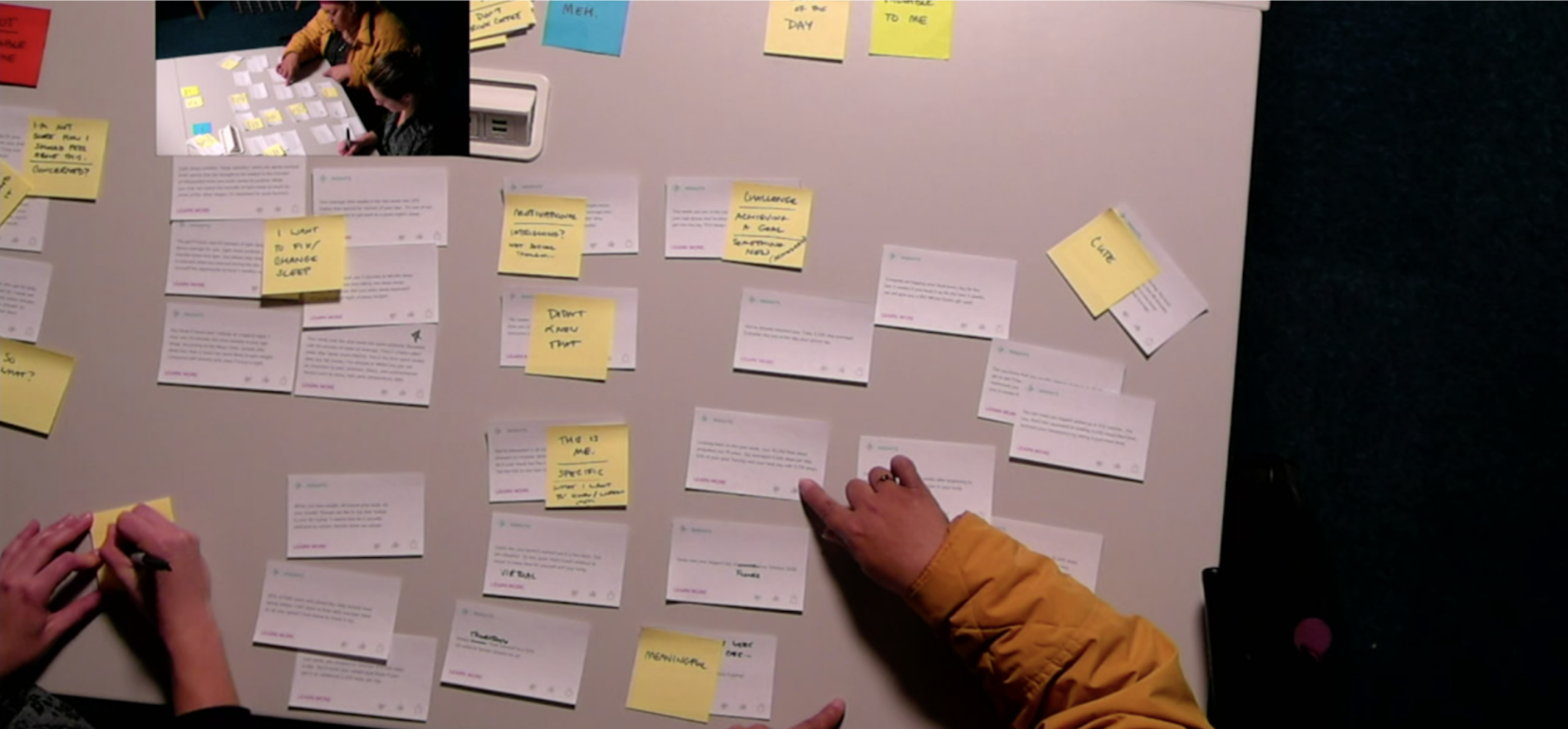
Starting with the user
As Liz and I dove into the project with our new PM partner, Steve, we immediately ran a user study with nine external Fitbit users in order to understand: what makes a compelling insight; what underlying user needs they should address; the integrity and parameters of our existing 2.0 framework; and viability of Insights as a path to Premium services. To do this, each tester provided feedback on a curated set of 40 personalized insight prototypes that Liz and I generated in collaboration with our Data Scientist, Karla.
What did we learn? Well, when we put insights in front of users, we learned that users evaluate them not by the type of data shown but by how useful and relevant the information provided is to them personally. We also learned that the majority of users wouldn’t pay for this content by itself. These findings were the catalyst for reframing our thinking internally to center around guidance, leverage behavior change principles, and focus on outcomes.
Higher personalization does not always mean higher value (right image).
Definitions and frameworks
To start, we established a working definition for insights—an intuitive tool that gives users personalized analysis of their data/habits/trends, which provide narrative cues (like a coach) that motivate, encourage, and offer guidance to help them on their health & wellness journey. We also solidified some guiding principles for content development based on our research study, and developed a formula for what makes up an insight.
“Insights are an intuitive tool that gives users personalized analysis of their data/habits/trends, which provide narrative cues (like a coach) that motivate, encourage, and offer guidance to help them on their health & wellness journey.”

Insights formula.
At the end of this process, I distilled our thinking into a product framework that accounted for three types of insights that could scale across a user’s journey and Fitbit experience. At the time, given the lack of appetite we heard from users to pay for such content, we decided that Resource and Guidance Insights would be free, and Holistic Insights would be paid (Premium). We felt that keeping most content free—like it currently was with Insights 1.0—met user expectations and would support an engagement play to involve and retain users with Fitbit.
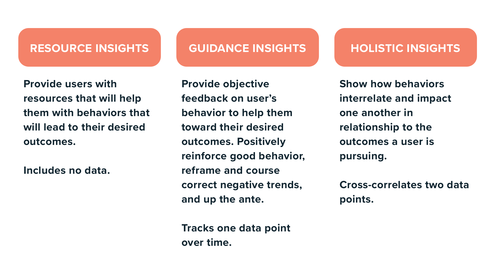
Three types of Insights based on context—it includes data or doesn’t include data.
Design
As I moved into UI and UX, this overlapped with a broader redesign of the Fitbit app experience and creation of a new design system. Within this new experience, the user’s primary home page/dashboard would be “Today” and, at the very top of it, there would be a dedicated space that would contain personally-relevant, personalized messages for the user, based on targeting criteria—most of those messages being Insights. Therefore, the design for Insights was both dependent on tight collaboration with the redesign team, and constrained by the MVP direction. Learn more about Fitbit Focus here.
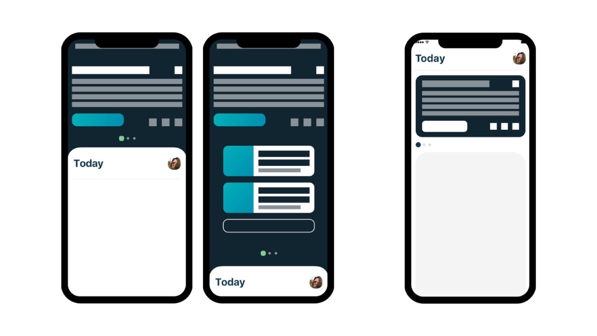
Fitbit Focus vision (left) compared to MVP (right). The card form factor was a design constraint.
Since the form factor of the Insights card was predetermined at a systems level by the larger redesign team (myself included), I applied similar systematic thinking for defining the UI details of each Insight. Seeing as Insights represented each core Fitbit pillar—Activity, Sleep, Nutrition, Mindfulness—each respective Insight inherited the associated color and iconography per category. The only exception was Holistic Insights, which inherited the teal brand color. To nudge the user to take action on what the Insight was saying, there’s an optional call to action button in the bottom left corner. The reason why we left-aligned the call to action was because the feedback loop (thumbs up/down) was persistent and, at the time, a higher priority for personalizing the Insights engine and user experience.
Insights feedback loop.
Final UI system for Insights.
While iterating on the overall look, feel, and interactions of these cards, I also created UI and UX guidelines to document insight templates, maximum character counts, and future thinking for how the space could evolve. These guidelines were mainly in service to Fitbit Focus but they proved to be super valuable for cross-functional teams and Engineering when they had design questions during implementation and launch.
Snapshots of UI and UX guidelines that I created.
Content development
As Engineering solidified UI, UX, and implementation logic, the next challenge was to start writing the insights themselves. To do this, we leveraged the content formula, partnered with Data Science to codify those data points into accessible, plug-and-play inputs for our backend engineers to pull from, and hired a freelance copywriter to draft hundreds of insights per our guiding principles. However, because there were so many stakeholders, no centralized CMS tool, and missed expectations from the Data Science team, I partnered with Steve, Liz, and our Program Manager, Nancy, to create a content development process. We also leveraged the collaborative power of Google Sheets to serve as our shared content repository.
All in all, crafting the actual copy for Insights was no easy feat. It was definitely a team effort in which we all drafted, reviewed, and prioritized which insights to productize and roll out to users to test.
Our makeshift CMS tool/content repository—aka, Google Sheets.
Testing and rollout
Testing Insights culminated in three rounds of internal testing with Fitbit employees, and two rounds of external testing with users as part of a limited public beta. Since by this point, the product itself was already viable and existed as an MVP, the purpose of these tests were to gauge overall user satisfaction, usefulness, and tone as we released more and more content.
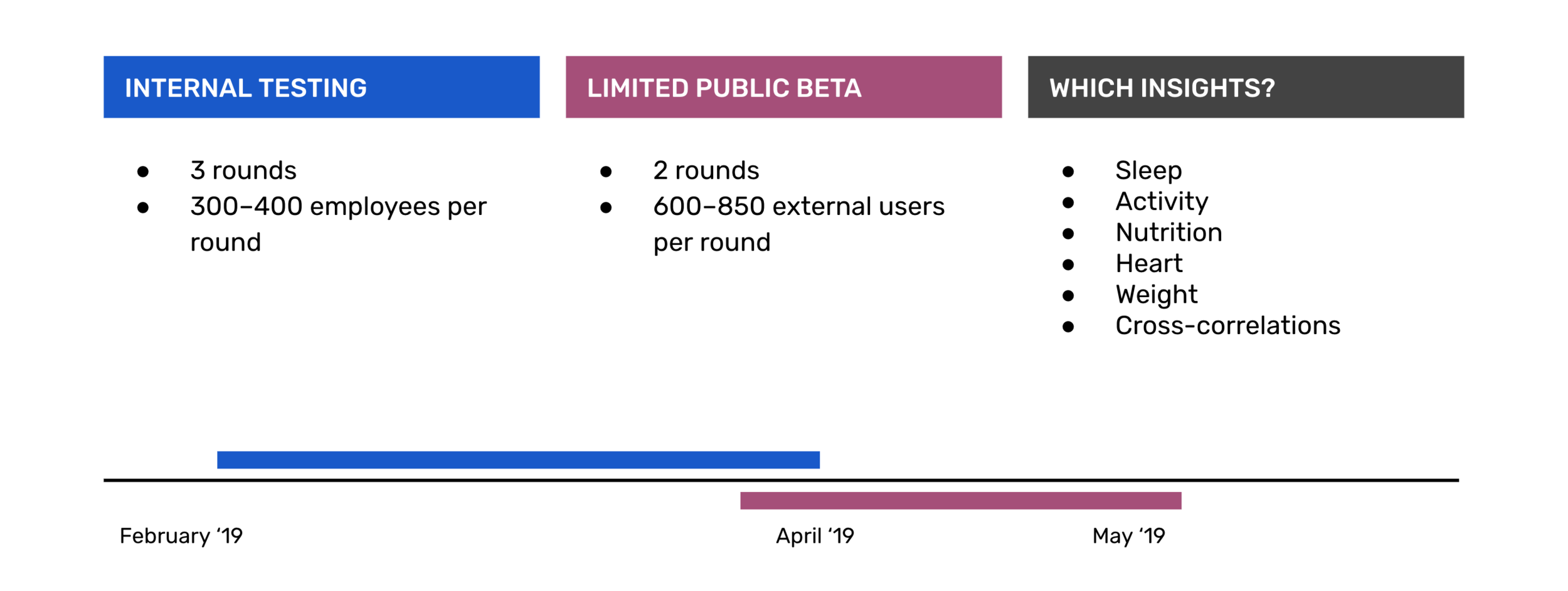
Pre-launch testing plan.

Limited Public Beta testing results.
Unfortunately, I left Fitbit before Insights 2.0 launched 100% to all users. However, what I do know is that in the 11th hour before launching Insights 2.0 as a holistic feature with the larger app redesign, the Insights and redesign teams were pressured by the CEO, Marketing, and Product leadership to shift course a bit. For Insights specifically, the direction was to make only Resource Insights free, and put Guidance and Holistic Insights behind the paywall. From a UI perspective, the redesign team adjusted the system color palette and veered away from a card UI to full-width.